Creating Forms in HTML
HTML Lesson 7:
Creating Forms in HTML
Creating and working with forms in HTML
All controls, such as text fields, buttons, checkboxes, drop-down lists, etc., are usually placed inside a form :
HTML
<form action="file.php" method="post" id="form">
  <!-- form contents -->
</form>formControls, of which there can be as many as you like, should be located just inside the element.
Form attributes:
action(English “action”)A file on the server with code for processing sent data | action="http://www.name.domain/program name" |
enctype(English: “encoding type”) | text/plain (plain text) application/x-www-dorm-urlencoded (for the POST method of submitting a form) multipart/form-data (for the POST method, if files are attached) |
method(method of sending data) | post get |
- The attribute
actionspecifies a server-side script file responsible for the primary processing of data sent from the form. Typically, the code for this file is written in a server-side programming language, such as PHP or Perl. - The attribute
enctypeindicates the type of information transmitted to the server; if it is just text data, thentext/plainIf files are sent with the form, thenmultipart/form-data. - This attribute
methodspecifies and defines the form of data transfer. We won’t go into detail about this, but it’s worth noting that for a more reliable transfer, the method should be specified.post.
HTML form elements
<label for="login">Login</label>
<input
  type="text"
  id="login"
  name="login"
  value=""
  placeholder="Enter login"
  maxlength="25"
  autocomplete="username"
  required
/>
Result:
Attributes:
- The value of the attribute
type—text— indicates that this is a text field. size— the size of the text field in charactersmaxlength— the maximum number of characters that fit in the fieldvalue— the original text in the text fieldname— the name of the element, required for processing data in the handler file
- The value of the attribute
HTML
<input type="password" name="pass" size="20" placeholder="Password" maxlength="Result:
Instead of text, a mask is displayed in the field – asterisks or circles
<TextBox text="<button type="submit"">Submit Data</button>" />
Result:
The button submit collects all the data from the form entered by the user and sends it to the address specified in action the form attribute.
Result: The button returns the state of all controls to the initial state (clears the form)
<fieldset>
  <legend>Select Technologies</legend>

  <label for="tech-asp">
    <input type="checkbox" id="tech-asp" name="tech" value="asp">
    ASP
  </label>

  <label for="tech-js">
    <input type="checkbox" id="tech-js" name="tech" value="js" checked>
    JavaScript
  </label>

  <label for="tech-php">
    <input type="checkbox" id="tech-php" name="tech" value="php">
    PHP
  </label>

  <label for="tech-html">
    <input type="checkbox" id="tech-html" name="tech" value="html" checked>
    HTML
  </label>
</fieldset>
Result:
ASP
JavaScript
PHP
HTML
In HTML, a checkbox is used to organize multiple choices, i.e., when it is necessary and possible to select several answer options.
Attributes :
- The attribute
checkedimmediately sets the element to be checked. - Attributes
namearevaluenecessary for the programmer to process the element. Therefore, they can be omitted.
- The attribute
<label><input type="radio" name="book" value="asp"> ASP</label><br>
<label><input type="radio" name="book" value="js"> JavaScript</label><br>
<label><input type="radio" name="book" value="php"> PHP</label><br>
<label><input type="radio" name="book" value="html" checked> HTML</label>
2. Semantic CSS Layout (Using <fieldset> and Flexbox) Replacing legacy <br> tags with proper CSS layout styling provides clean visual spacing and semantic structure.
HTML
<fieldset style="border: none; display: flex; flex-direction: column; gap: 8px;">
  <legend>Select a Book:</legend>
  <label><input type="radio" name="book" value="asp"> ASP</label>
  <label><input type="radio" name="book" value="js"> JavaScript</label>
  <label><input type="radio" name="book" value="php"> PHP</label>
  <label><input type="radio" name="book" value="html" checked> HTML</label>
</fieldset>
Result:
ASP
Javascript
PHP
HTML
A radio button in HTML is used to select a single option from several options.
Attributes:
- The attribute
checkedimmediately sets the element to be checked. - The attribute
valueis required for the programmer to process the element. Therefore, it can be omitted.
HTML drop-down list
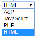
Let’s look at an example of adding a drop-down list:
HTML
<select name="book" size="1">
    <option value="asp">ASP</option>
    <option value="js">JavaScript</option>
    <option value="php">PHP</option>
    <option value="html" selected="selected">HTML</option>
</select>
Result:
- The drop-down list consists of the main tag –
select– which has a closing pair, and each list item is a tagoptioninside which the text of the item is displayed.
- The drop-down list consists of the main tag –
Attributes:
- An attribute
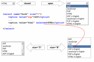
sizeA value of “1” indicates that the list, in collapsed form, displays one item, with the rest opening when you click the menu arrow. - The attribute
selectedof an item (option) indicates that this particular item will be initially visible, and the other items will be “collapsed.” - The attribute
valueis required for the programmer to process the element. Therefore, it can be omitted.
For large and complex lists, it is possible to add subheadings – a tag optgroupwith an attribute label(caption):
<select name="book" size="1">
	<optgroup label="English">
		<option value="asp">ASP</option>
		<option value="js">JavaScript</option>
		<option value="php">PHP</option>
		<option value="html" selected="selected">HTML</option>
	</optgroup>
	<optgroup label="Russian">
		<option value="asp_rus">ASP in Russian</option>
		<option value="js_rus">JavaScript in Russian</option>
	</optgroup>
</select>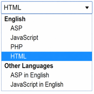
To allow multiple selections, you need to add the attribute multiple. However, in this case, the attribute sizeshould also be set to a value greater than 1:
<label for="book-select">Select Books:</label>
<select id="book-select" name="book" size="4" multiple>
  <option value="book1">Book 1</option>
  <option value="book2">Book 2</option>
  <option value="book3">Book 3</option>
  <option value="book4">Book 4</option>
</select>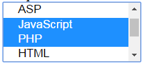
Text area in HTML
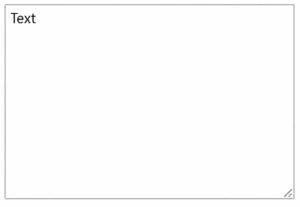
To enter a large piece of text, use the text area element:
<textarea name="description" rows="10" placeholder="Enter description..."></textaResult:
Attributes:
- The width of an element depends on the attribute
cols, which specifies how many characters fit horizontally. - The attribute
rowsdefines the number of lines in the element. - The attribute
nameis required for the programmer to process the element. Therefore, it can be omitted.
Other elements
HTML
<button type="button">Do something</button>
HTML
<input type="image" src="1.png" alt="Submit" width="32" height="32" />Result:
There is a special control for attaching a file to a form:
HTML
Result:
When using it, the form encoding value (attribute enctype on the tag form) must be set tomultipart/form-data
A hidden field is an important programming element. It is not displayed in the browser window, but is intended to pass additional data through the form to the processing file.
1. Modern HTML5 (Self-Closing Optional): Standard HTML5 does not require the closing slash:
HTML
<input type="hidden" name="uid" value="15362">
2. Modern Syntax with Data Attributes:s If you are passing this to JavaScript rather than submitting a traditional HTML form, data attributes are cleaner and more semantic:
HTML
<div id="user" data-uid="15362"></div>Additional elements and attributes
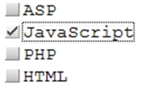
Label for:
- For radio and checkbox controls, it’s convenient to use additional elements that, firstly, bind the text to the radio or checkbox element itself, and secondly, add a border when clicked:
<input type=”checkbox” id=”book1″><label for=”book1″>ASP</label>
In this example, a label (tag label) is created for the element checkbox. The binding is accomplished via the attribute id, the value of which is specified in for the label attribute.
Result:
- The attribute
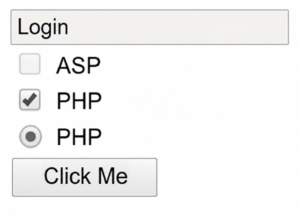
disabledallows you to lock an element, making it inaccessible for modification by the user:
- The attribute
<form>
  <div class="form-group">
    <input type="text" name="login" size="20" value="Login" maxlength="25" disabled>
  </div>

  <div class="form-group">
    <label>
      <input type="checkbox" name="asp" value="yes"> ASP
    </label>
  </div>

  <div class="form-group">
    <label>
      <input type="checkbox" name="js" value="yes" checked disabled> JavaScript
    </label>
  </div>
</form>
Result:
- This attribute
readonlymakes text documents read-only (text cannot be entered or modified):
- This attribute
<input type="text" name="login" value="Login" maxlength="25" readonly>
Result:
- To visually design a group of objects, you can use the element
fieldset:
- To visually design a group of objects, you can use the element
HTML
<fieldset>
  <legend>Books</legend>
  <label>
    <input type="checkbox" name="books" value="html"> HTML
  </label><br>
  <label>
    <input type="checkbox" name="books" value="asp"> ASP
  </label><br>
  <label>
    <input type="checkbox" name="books" value="js"> JavaScript
  </label>
</fieldset>
Result:
- You can set the order of movement through the elements using the key
TAB:
- You can set the order of movement through the elements using the key
<!-- Native focusable elements (buttons, inputs, links) -->
<button tabindex="1">First Focused</button>

<!-- Custom/Non-interactive elements (divs, spans) -->
<div tabindex="1" role="button" aria-label="Custom Button">First Focused Div</div>
The element will be the first in the transition queue.
Explore More IT Terms
#
- Using an integrating factor
- Equations in total differentials
- Bernoulli's equation
- Linear differential equations of the first order
- 10 Mixed C++ Challenges to Test Your Skills
- 11 Tricky Non-Technical Questions to Ask in a Recruiting Interview
- 50 Terms Every Programmer Should Know
- 52 Java Thread Interview Questions
- 7 Levels of Using the Zip Function in Python
- 7 Python Code Bugs You Need to Fix
- 70+ Free Resources for Learning Programming
A
- A Comprehensive Guide to HTML and CSS
- A Comprehensive Guide to MODX CMS
- A computer science question tests your ability to work with IP addresses and network masks
- A Guide to SQL Query Formatting for Beginners
- A/B testing
- Abstract Data Type (ADT)
- AES Encryption Algorithm: How It Works and Where It's Used
- Agile
- Algorithm
- Algorithm Analysis
- Algorithm Complexity-Key Points
- Algorithm complexity: deep parsing O(log n)
- Algorithm vs. Program
- Algorithms and Data Structures in C#
- An overview of the C # programming language
- An overview of the Python programming language
- Anaconda Python
- Analysis of graphs and adjacency matrices question
- Android
- Android App Bundle
- Android SDK
- Angular
- Ansible
- Apache
- Apache Airflow
- Apache Kafka
- Apache Tomcat
- App Store
- AppCode
- Applications of microcontrollers: From simple circuits in electronics to complex systems
- Applications of the derivative
- Arduino: How to Program It: Basics for Beginners
- Array-based stack
- ArrayList
- ASCII
- ASP.NET
- Assembly Language Lessons
B
C
- C++ Lessons
- Cache
- Calculating Memory Capacity
- Character sets and encodings
- Characteristics of a good Algorithm
- Circular singly linked list
- Coding Tests with Answers
- Combinational Circuits Solved Questions
- Compiler
- Complexity of algorithms-Tutorial
- Computer Science Fundamentals Test with Answers (47 questions)
- Computer science tests with answers (More than 100 Questions)
- Constants
- Creating a Table in HTML
- Creating Forms in HTML
- Creating Lists
- Cybernetics and informatics
- Cycles
D
- Data Analytics: applications of data analysis in companies
- Data Engineer - Who is it, what does a data engineer do, and an overview of the profession
- Data modeling: what it is, types, and process steps.
- Data preprocessing: a complete guide for beginners and professionals.
- Data structure
- Data Structures and Algorithms (DSA)
- Data types vs. Data structures
- Database Tests with Answers
- Deep Learning
- Defining Aliases
- Defining Arrays
- Deque
- Detailed articles and tutorials on PHP
- Developing a Website from Scratch
- Differential Equations
- Differentiation of functions
- Digital data: understand the importance of this asset for businesses.
- Double integrals
- Doubly linked lists
- DSA Tutorial
E
F
G
H
- Handling errors and exceptions
- Heads or Tails? How Probability Theory Is Used in IT
- History of the development of computer science
- Homogeneous equations
- Homogeneous vs. non-homogeneous structures
- How to effectively organize your workflow
- How to Learn Java: Tips for Beginner Developers
- How to Learn PHP: A Beginner's Guide
- How to Use S3 Storage in Kubernetes with CSI
- HTML
- HTML and CSS: Definition, Application, and Operating Principles
- HTML and CSS. Layout from Scratch: What to Learn, Where to Learn, and How Long Will It Take?
- HTML Frame Structure
- HTML Link Formatting
- HTML Quizzes with Answers
I
- if..else construction
- Infinite sequences and series
- Information properties
- Inheritance in Java: A Complete Guide to Principles and Implementation
- Inserting an Image
- Integration of functions
- Interactive Python Tutorial – Learn Programming from Scratch
- Interpreter
- Interview Problem: Finding a Deleted Element in O(N)
- Interview Scare: The FizzBuzz Challenge
- Introduction to C++
- Introduction to Machine Learning
- Introduction to Networking | Network Fundamentals Part 1
- Introduction to Number Systems (Binary, Octal, Hexadecimal) | Math for CS Foundations #1
- IT Specialist Resume (CV)
J
K
L
M
- Machine Learning
- Machine Learning Basic Tool: NumPy
- Machine Learning Basic Tool: Pandas
- Machine Learning Mathematics
- Mathematics for programmers: what is really needed?
- MD5 encryption algorithm: What is it and why is it needed?
- Microcontroller and Microprocessor - what's the difference?
- ML Engineer: Who They Are, What They Do, How Much They Earn, and How to Become a Neural Network Specialist
- Monte Carlo Simulation: How It Works and What It's For
O
P
- PHP lessons
- Private DNS server and its configuration
- Program code
- Programmer's Dictionary
- Programming
- Programming with pseudocode
- Python Code Formatting Guide: PEP8
- Python for data analysis: how to do it and main libraries
- Python Lessons
- Python Superstar: 5 Ways to Use the * Operator
- Python vs. Julia: Should You Replace Python with Julia?
R
S
- SFML Graphics Library Tutorials
- Sorting Algorithms in Programming: Types, Descriptions, and Comparisons
- SQL commands: see what they are, what the main ones are + examples
- SQL Interview Questions and Tasks
- SQL Lessons
- SQL Stored Procedures
- SQL Syntactic Sugar: The COALESCE Function
- Stack
- Start in analytics: Python or R
- Static vs. dynamic data structures
- Statistical analysis: importance for decision making.
- String formatting in Python
- Structure of computer science
- Swift Lessons
- switch/match construct
- Syntax
T
- Terms in programming
- Text and paragraph formatting tags
- The Complete Guide to Bootstrap
- The Complete Guide to JavaScript
- The concept of information and its transmission
- The Future of Python: Key Trends and Insights from Global Researc
- The Infrastructure of Code: A Complete Guide to Repositories for Languages, Frameworks, and Compilers
- The pip package manager in Python
- The role of informatization in the development of society
- Transfers
- Tricky Java Questions Often Asked in Interviews
- Tutorials / Articles
- TypeScript: What It Is and Why Developers Need It
W
- What are databases, and why do they need DBMS and SQL?
- What do Linux distributions consist of?
- What is .NET and what is it used for?
- What is a data structure?
- What is a GPU in a computer, in simple terms?
- What is a quantum computer: 100,500 problems in one second
- What Is an Algorithm?
- What is Arduino: How it Works and the Platform's Capabilities
- What is Big Data? Introduction, Types, Characteristics, and Examples
- What is FizzBuzz Challenge?
- What is Golang and what is it used for?
- What is Haskell and what is it used for?
- What is Kotlin and what is it used for?
- What is Linux? The History of Linux
- What is machine learning, and how does it work?
- What is Power BI: everything about the data analytics software
- What is recursion, recursive and iterative process in programming?
- What is the C++ programming language?
- What is the OSI Model: A Complete Explanation of the Seven Layers and Their Role in Networking
- What's the difference between x86 and ARM processors?
- Where to start learning the C programming language?
- Which Linux distribution should you choose? A Linux distribution overview